Portrait of a Kiln
Crossdraft is a ceramic gallery run by Richard Munster.
- Identity
- Naming
- Print & Signage
- Social & Motion

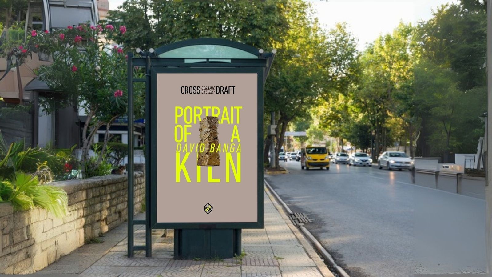
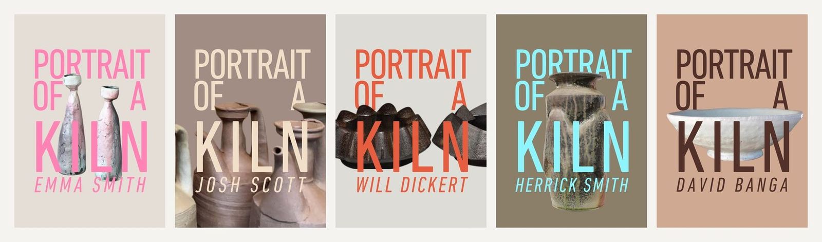
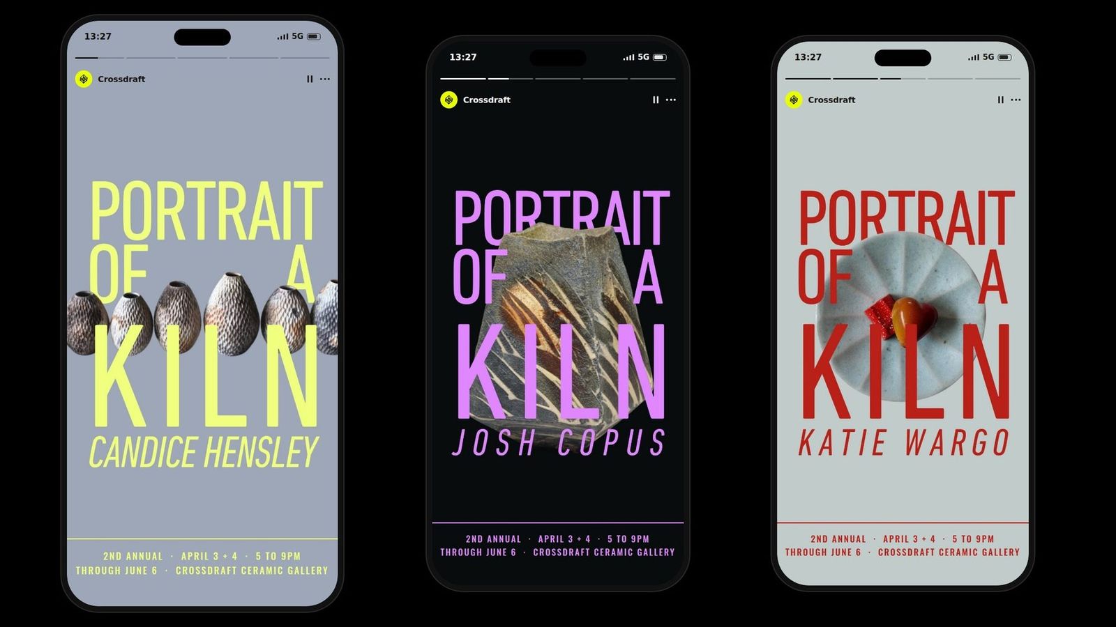
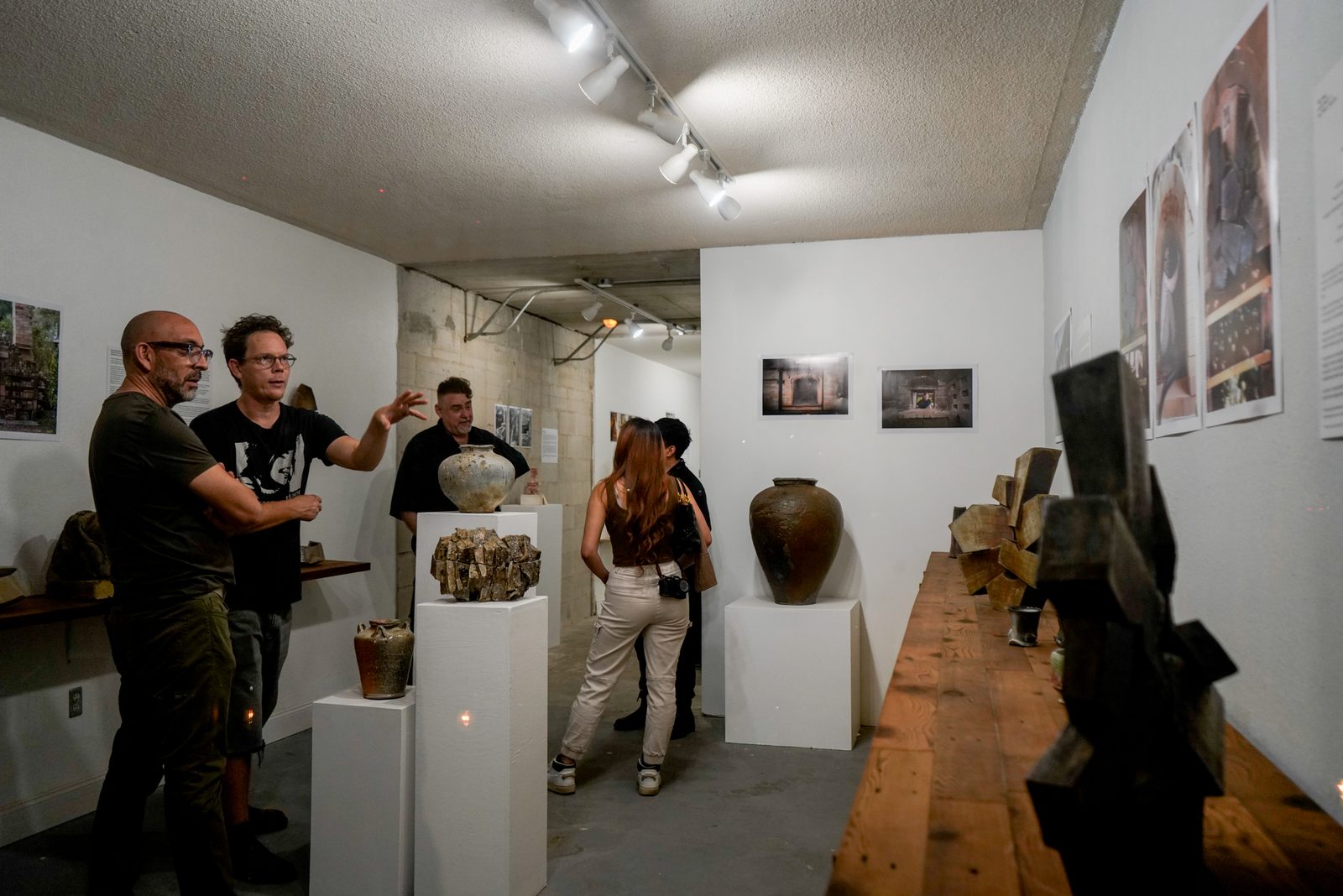
Crossdraft is a ceramic gallery run by Richard Munster. Portrait of a Kiln is its annual show, where the work of eight potters hangs together for two months. We built the identity for the gallery and the campaign for the show, then did it again the following year.
The problem
Ceramics shows are advertised badly. Soft type, a photograph of a pot, a beige flyer on a coffee shop board. The work inside is hard, fired, structural, and none of that reaches the poster.
The word
Richard had the name before we got there. A crossdraft is a kiln where the flame travels sideways through the chamber instead of climbing it. Every potter knows the word. Nobody outside the field does, which is what made it worth drawing: exact for the people who matter, and a question for everyone else.
The mark
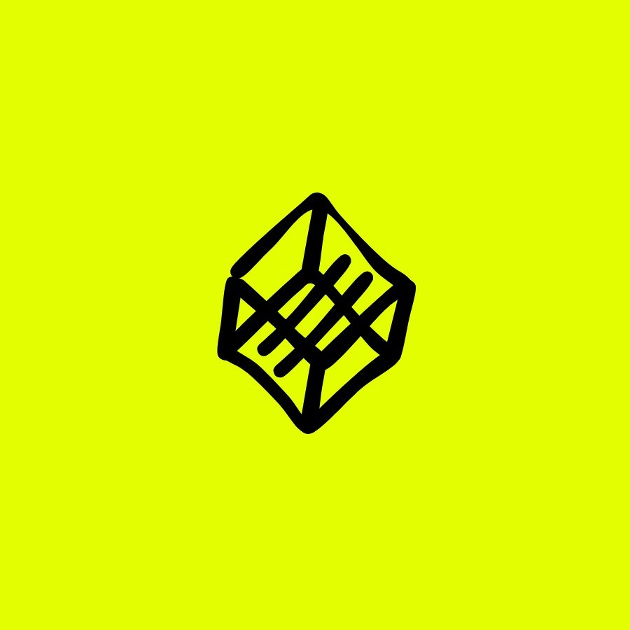
A kiln is a box you push air through. The icon draws the air. A form held in perspective with the draft cut straight across it, so the movement reads before the container does. Set between the two words, it turns CROSS and DRAFT into the two sides it passes through.
Color
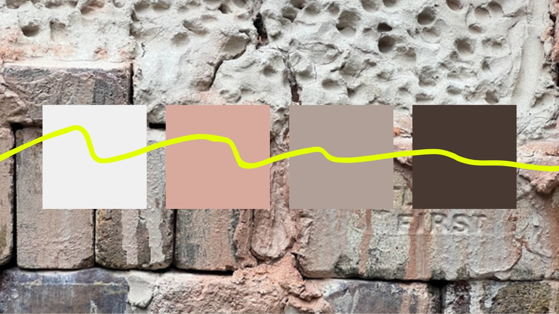
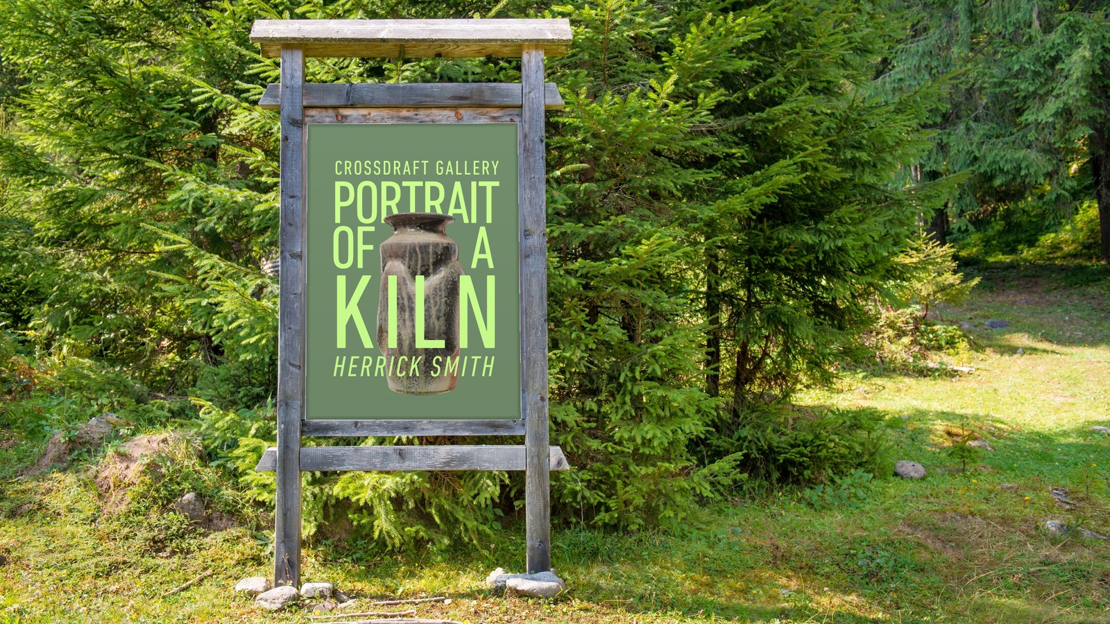
Acid yellow and black for the gallery, drawn from the brand hub and used anywhere Crossdraft speaks as itself. The show prints the other way round: black type on white paper, so the work in the room supplies all the color. Clay is brown, studios are brown, and a brown flyer disappears into both. Online each artist gets a ground and a type color pulled off their own pots, which is how eight posters stay one set and still look like eight different makers.
The show system
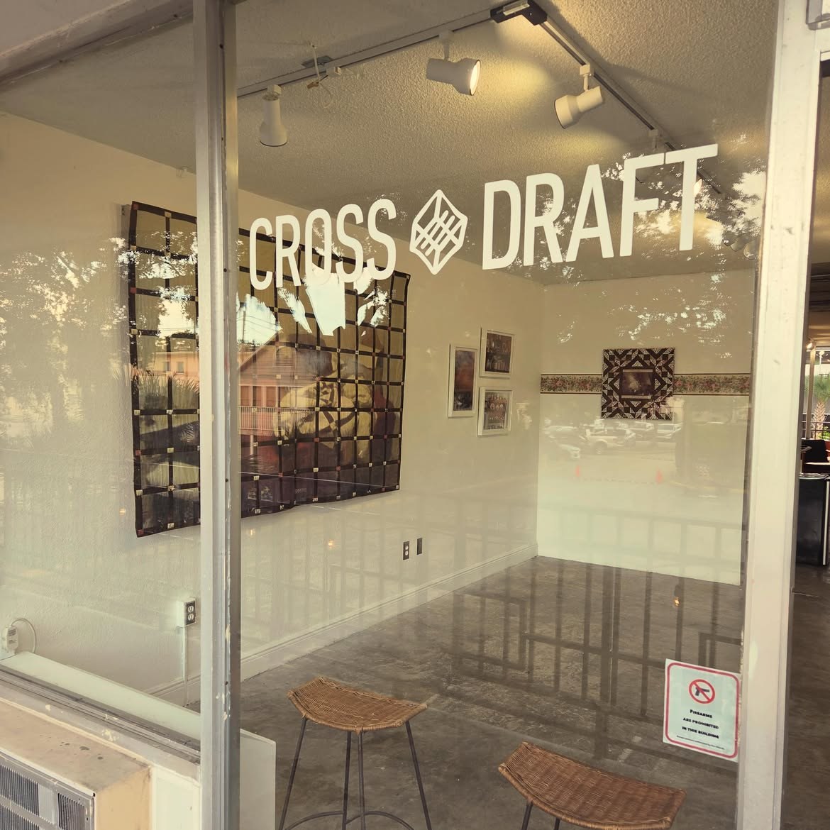
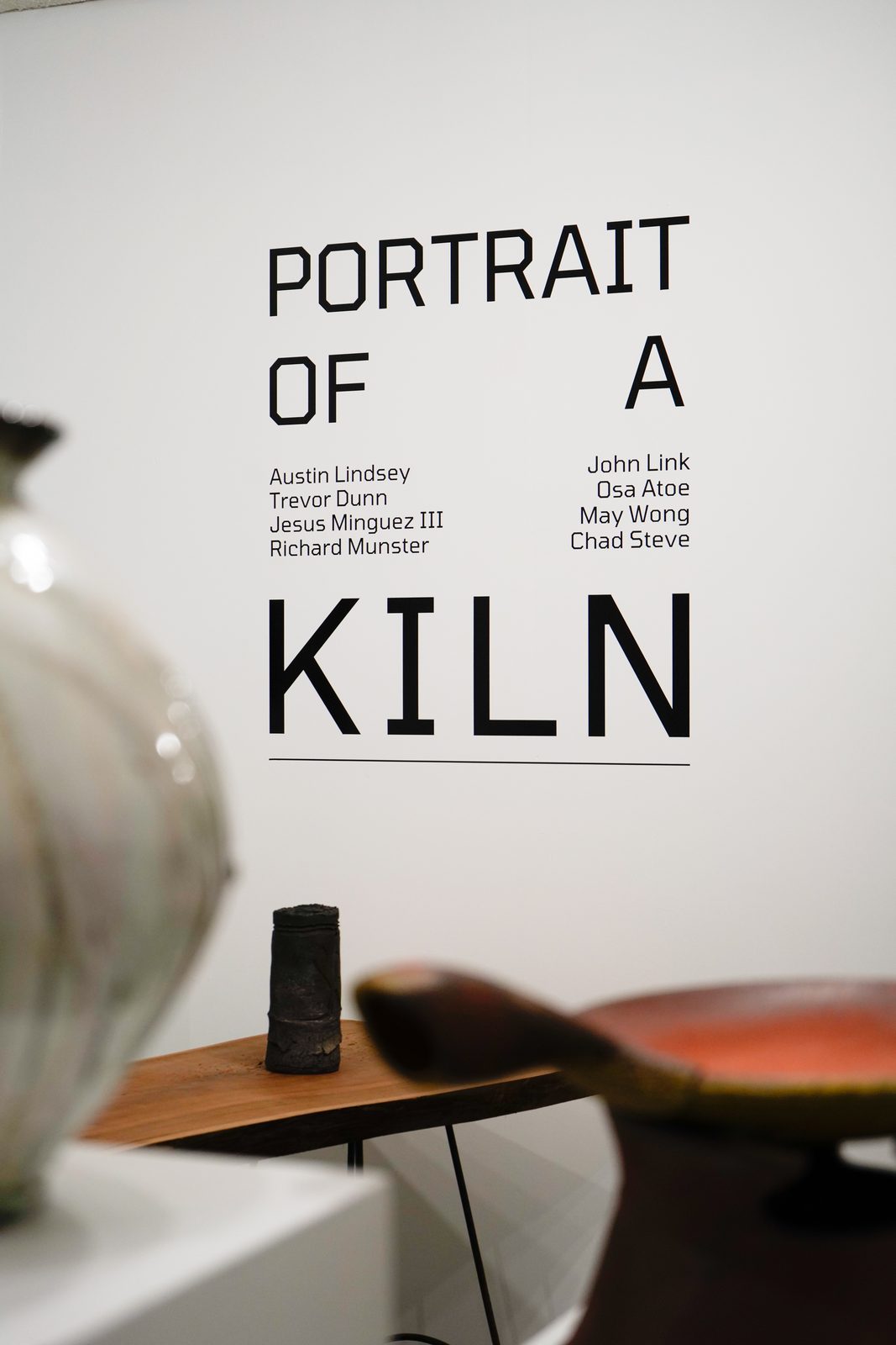
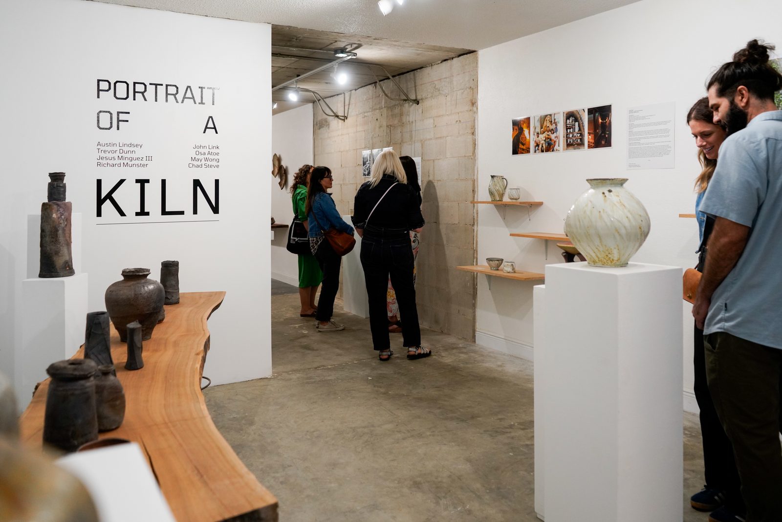
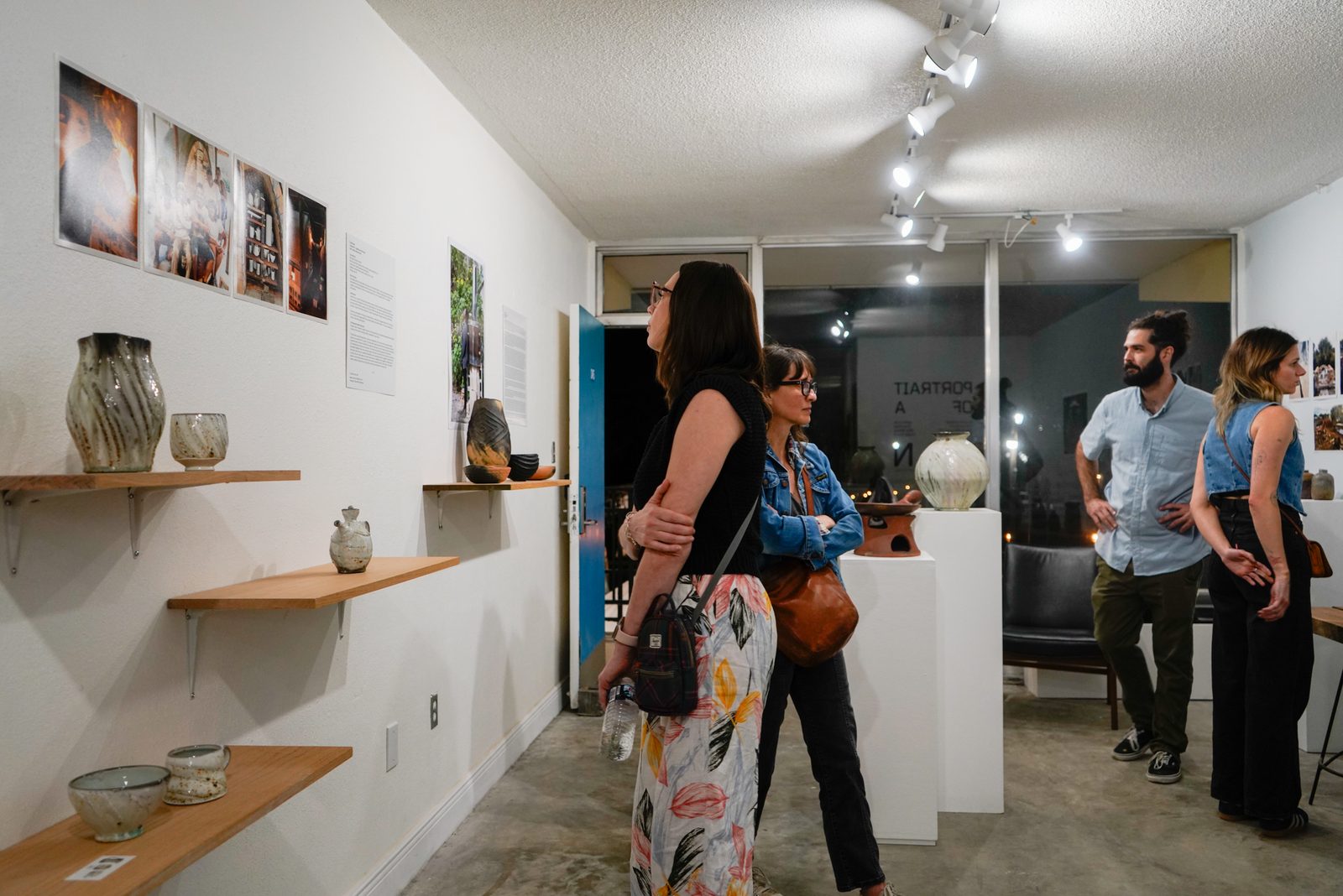
Portrait of a Kiln runs on one layout: the title stacked in condensed capitals, the artist names in two columns, the dates, the year. Every artist also gets the same poster with their name alone under the title, which is what goes out on social in the weeks before the opening. The same artwork scales to a vinyl decal covering the gallery wall, the first thing you see through the door and the thing everyone photographs.
The whole thing lives in a master hub, so Richard pulls the wordmark, the icon, the isolated words, the poster files and the social set without asking anyone.
Second year
The 2026 edition is the second annual, opening April 3 and 4 from 5 to 9pm and running through June 6, with David Banga, Josh Copus, Will Dickert, Emma Smith, Josh Scott, Katie Wargo, Herrick Smith and Candice Hensley. In August the whole thing travelled to CoHab Space in High Point, North Carolina, where it runs through September 30. Same name, same system, a room none of it was drawn for.
Client: Crossdraft Ceramic Gallery
Sector: Arts and culture
Disciplines: Brand identity, print and signage, social
Team: Richard Munster, Michael Luis Diaz
Photography: Jabe Jones (gallery exterior)